ClerkUserButton
Clerk's ClerkUserButton renders a panel that displays the signed-in user's profile and provides account management controls.
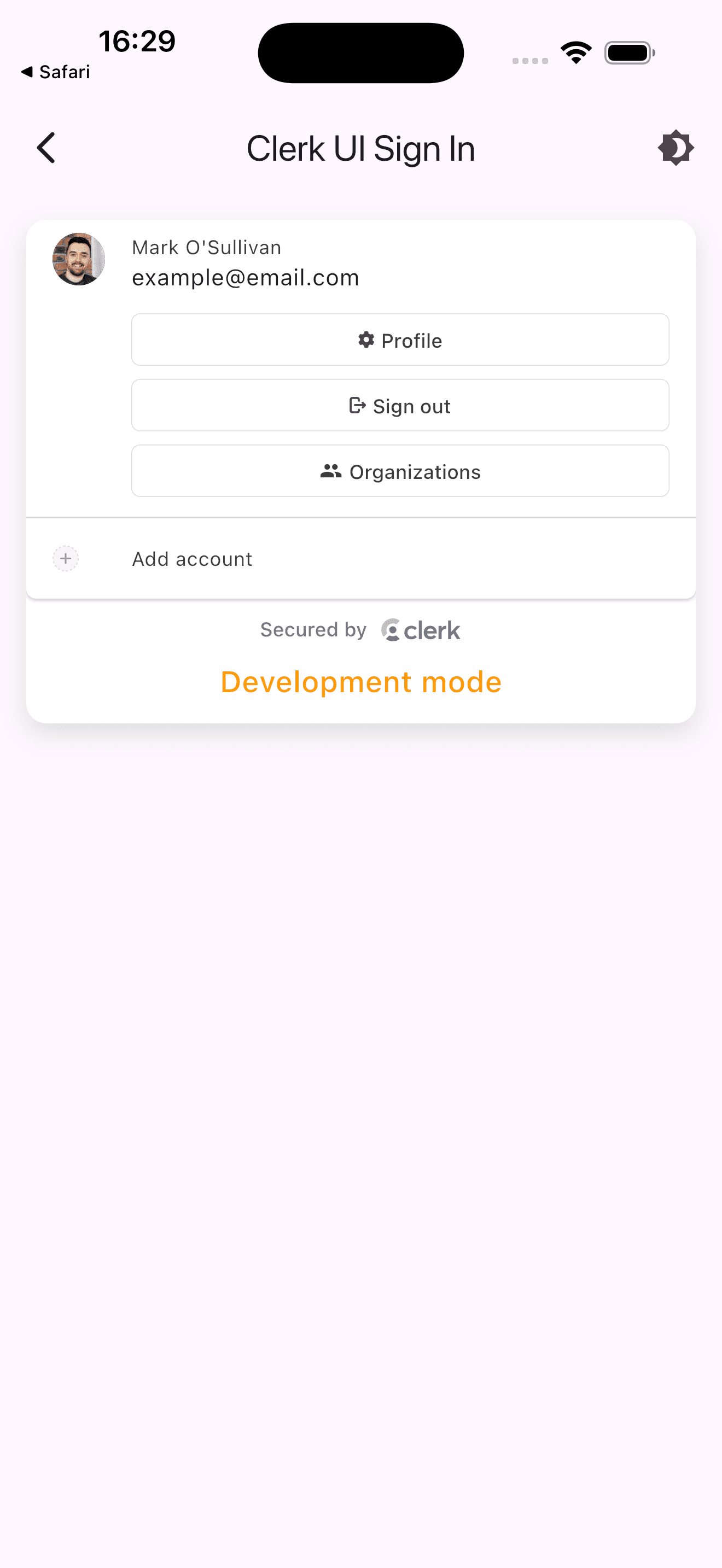
The ClerkUserButton renders a panel that lists all currently signed-in sessions and provides controls to manage
accounts and sign out. When a session row is selected, action buttons appear for managing the profile, signing out,
and accessing organizations (if enabled). When multiple sessions are active, a Sign out of all accounts button
is shown at the bottom.
The ClerkUserButton is intended for use when a user is signed in. Place it in a part of your widget tree that
is only reachable after authentication.
ClerkUserButton must be placed somewhere below a ClerkAuth widget in the widget tree.
Parameters
showName
Type: bool
Whether to display the user's name alongside their avatar in each session row. Defaults to true.
sessionActions
Type: List<ClerkUserAction>?
A list of actions rendered as buttons within the selected session row. When not provided, defaults to Profile, Sign out, and (if organizations are enabled) Organizations.
additionalActions
Type: List<ClerkUserAction>?
A list of actions rendered as rows below the session list. When not provided, defaults to Add account (only in multi-session mode).
ClerkUserAction parameters
Each entry in sessionActions and additionalActions is a ClerkUserAction:
label
Type: String
The text label displayed for the action. Required.
callback
Type: FutureOr<void> Function(BuildContext, ClerkAuthState)
The function invoked when the action is tapped. Receives the current BuildContext and ClerkAuthState. Required.
icon
Type: IconData?
A Material icon to display alongside the label.
asset
Type: String?
An SVG asset path to display as the action's icon. Takes precedence over icon when both are provided.
Usage
Basic usage
The following example shows how to render ClerkUserButton when a user is signed in.
import 'package:clerk_flutter/clerk_flutter.dart';
import 'package:flutter/material.dart';

class HomeScreen extends StatelessWidget {
  const HomeScreen({super.key});

  @override
  Widget build(BuildContext context) {
    final user = ClerkAuth.userOf(context);

    if (user == null) {
      return const SizedBox.shrink();
    }

    return const ClerkUserButton();
  }
}
In an app bar
The following example shows how to place ClerkUserButton in an AppBar action.
import 'package:clerk_flutter/clerk_flutter.dart';
import 'package:flutter/material.dart';

class HomeScreen extends StatelessWidget {
  const HomeScreen({super.key});

  @override
  Widget build(BuildContext context) {
    final user = ClerkAuth.userOf(context);

    return Scaffold(
      appBar: AppBar(
        title: const Text('Home'),
        actions: [
          if (user != null) const ClerkUserButton(),
        ],
      ),
      body: const Center(child: Text('Welcome!')),
    );
  }
}
With custom actions
The following example shows how to add a custom action to the session row and an additional action below the session list.
import 'package:clerk_flutter/clerk_flutter.dart';
import 'package:flutter/material.dart';

class HomeScreen extends StatelessWidget {
  const HomeScreen({super.key});

  @override
  Widget build(BuildContext context) {
    return ClerkUserButton(
      sessionActions: [
        ClerkUserAction(
          icon: Icons.settings,
          label: 'Settings',
          callback: (context, authState) async {
            // Navigate to settings
          },
        ),
        ClerkUserAction(
          icon: Icons.logout,
          label: 'Sign out',
          callback: (context, authState) => authState.signOut(),
        ),
      ],
      additionalActions: [
        ClerkUserAction(
          icon: Icons.help_outline,
          label: 'Help',
          callback: (context, authState) async {
            // Open help page
          },
        ),
      ],
    );
  }
}
Customization
To learn how to customize the Clerk widgets, see the theming guide.
If Clerk's prebuilt widgets don't meet your specific needs or if you require more control over the logic, you can rebuild the existing Clerk flows using the clerk_auth package.